

Best overall: Canva. Best for collaborative website handoffs: Figma. Best for color palette exploration: Coolors. This 2026 guide compares the best brand board tools for turning colors, typography, and imagery into a reference you can actually use.
- Canva leads the best brand board tools for coaches and authors creating a practical visual reference.
- Figma suits collaborative website handoffs; Milanote suits image-led creative direction.
- Coolors and Adobe Color support color palette decisions, not complete brand boards.
- Bridgetbakerbranding serves coaches, speakers, authors, and founders who need branding and Squarespace website design.
A tool organizes your visual decisions; it does not decide your positioning. Bridgetbakerbranding provides branding, Squarespace website design, and visibility coaching for coaches, speakers, authors, and founders. Keep that distinction clear: software helps you assemble the reference, while branding work defines what the reference should communicate.
Why this matters
A brand board is a compact visual reference for your colors, typography, logo treatments, and image direction. A color palette is only one component. Choosing a palette generator when you need a complete board leaves you with attractive swatches but unanswered questions about how your website and content should look.
For your 2026 brand board, prioritize repeatable decisions over decorative presentation. Someone using the board should know which color belongs behind body text, which font is for headings, and which images fit your message. If they still have to guess, the board is unfinished.
Canva is the default choice for a founder assembling a usable brand board without a specialist design workflow. Choose another tool when your main task is more specific: exploring colors, collecting references, or coordinating website design.
What makes the best brand board tools
These criteria determine the recommendations below. The right tool handles your next task, not every possible design task.
- Complete reference: You can present colors, typography, logo assets, and image direction together rather than in separate documents.
- Color control: You can record exact color values and distinguish decorative colors from text and background combinations.
- Editing effort: You can update the board without rebuilding the layout whenever a font, image, or color changes.
- Collaboration: The people implementing your brand can review decisions in a shared working space.
- Handoff clarity: Your recipient gets an understandable reference, not an unexplained collection of swatches and screenshots.
- Task fit: The tool matches the job: palette exploration, visual direction, everyday content, or website implementation.
Do not confuse a large feature list with a clear handoff. A simple board with labeled decisions is more useful than an elaborate layout that hides the information your designer needs.
Best brand board tools at a glance
The order follows the use-case recommendations, not a claim that every tool performs the same job. Palette specialists appear alongside board-building tools because choosing colors and documenting a brand require different capabilities.
| Tool | Best for | Standout feature | Key limitation |
|---|---|---|---|
| Canva | Everyday brand boards | Visual layouts combining text, images, and colors | A board still needs explicit usage rules |
| Figma | Collaborative website handoffs | Shared design files with reusable styles and components | More setup than a simple presentation board |
| Milanote | Image-led creative direction | Flexible boards for images, notes, and references | Loose arrangements need editing before handoff |
| Adobe Express | Boards alongside social content | Visual design and content creation in one workspace | Not a substitute for detailed website specifications |
| Coolors | Fast palette exploration | Palette generation with individual colors you can lock | Does not document typography or image direction |
| Adobe Color | Color harmony exploration | Color-wheel harmony rules and image-based extraction | Does not assemble a complete brand board |
1. Canva: best brand board tool for everyday reference
Canva lets you arrange color swatches, font examples, images, and uploaded logo assets in a visual layout. It suits a coach, speaker, or author who needs a readable reference alongside everyday content design. You can build a straightforward board without starting with a website component system.
The useful result is not merely a polished page. Label each color by its intended role and show typography in actual heading and body-text examples. Keep decorative inspiration separate from approved assets so your collaborators know what to use.
Canva pros:
- Combines text, colors, images, and logo assets on one board.
- Supports a visual editing workflow rather than a technical specification document.
- Lets you create content designs in the same tool used for the reference.
- Suits a compact board that you can share as a visual document.
Canva cons:
- A template supplies a layout, not a brand strategy.
- Showing a font name or color swatch does not explain its intended use.
- A static board does not enforce consistency across separately created assets.
Best for: Founders who want an everyday visual reference they can maintain themselves.
Verdict: Buy — choose Canva as the default board-building tool, then add clear usage labels.
2. Figma: best brand board tool for website handoffs
Figma is a collaborative design tool with reusable styles and components. It works well when your brand board needs to connect with website layouts rather than stand alone as an inspiration sheet. A designer can show how colors and typography behave in interface elements within the same working file.
For a 2026 website project, organize the board around implementation. Show headings, body text, buttons, and background treatments together. This gives your website designer concrete relationships to interpret instead of isolated aesthetic choices.
Figma pros:
- Connects brand references with website design work.
- Supports reusable styles and components for consistent examples.
- Provides a shared file for design review and comments.
- Lets you document visual decisions beside their application.
Figma cons:
- Requires more design-file organization than a simple board needs.
- A crowded file can make approved decisions difficult to find.
- A Figma layout does not automatically become a finished Squarespace website.
Best for: Founders and designers collaborating on a website design handoff.
Verdict: Buy — choose Figma when the board must support website implementation, not just presentation.
3. Milanote: best brand board tool for creative direction
Milanote organizes images, notes, links, and other references on flexible visual boards. Its strongest role is gathering and discussing creative direction before every brand decision is final. Use it to compare photography styles, editorial references, and the feeling you want your materials to convey.
Separate exploration from approval. A board containing conflicting references is useful during discovery, but it is not a final instruction sheet. Create a clearly labeled approved area before handing the work to a collaborator.
Milanote pros:
- Brings visual references and explanatory notes together.
- Supports an open-ended arrangement for exploring direction.
- Helps show the relationship between imagery and written ideas.
- Suits discussion before a final visual system is settled.
Milanote cons:
- An inspiration board can leave exact color and typography choices unresolved.
- Flexible layouts require discipline to keep the final reference clear.
- Website specifications need more detail than a collection of references provides.
Best for: Coaches, speakers, and authors developing image-led creative direction.
Verdict: Buy — choose Milanote for discovery, then turn approved references into explicit rules.
4. Adobe Express: best brand board tool for content workflows
Adobe Express combines visual design with content creation. You can assemble a board using text, images, colors, and brand assets, then use the same workspace for related content. It fits a founder whose immediate need is a visual reference alongside social graphics and promotional materials.
Keep your board focused on decisions you will repeat. Include a heading treatment, a readable text treatment, and examples of image selection. These are more useful than filling the page with decorative elements that never appear in your content.
Adobe Express pros:
- Combines board creation with related content design.
- Supports text, imagery, and visual assets in a composed layout.
- Lets you demonstrate brand choices through actual content examples.
- Fits visual communication tasks beyond the board itself.
Adobe Express cons:
- A finished-looking layout can still lack practical usage instructions.
- It is not a replacement for a detailed website design specification.
- Choosing it solely for a board adds another workspace if your content lives elsewhere.
Best for: Founders who want a brand reference within an Adobe Express content workflow.
Verdict: Buy — choose Adobe Express when it also supports the content you need to produce.
5. Coolors: best color palette tool for fast exploration
Coolors generates color palettes and lets you lock individual colors while exploring alternatives. That makes it useful when you have an established color but need to investigate supporting combinations. You can also use image-based palette exploration to connect color ideas with visual references.
Treat the result as a candidate palette, not an approved brand system. Assign roles to the colors and check the actual text-background combinations before moving them into your board.
Coolors pros:
- Makes it straightforward to explore alternative color combinations.
- Lets you retain selected colors while changing others.
- Supports palette exploration without building a full design document.
Coolors cons:
- Does not document typography, logo treatments, or image direction.
- A harmonious palette does not establish accessible text pairings.
- Generated combinations still need a reason to belong to your brand.
Best for: Founders exploring supporting colors around an existing visual direction.
Verdict: Hold as a standalone brand board tool; use Coolors as a palette specialist.
6. Adobe Color: best color palette tool for harmony rules
Adobe Color provides a color wheel with harmony rules and tools for extracting themes from images. It suits a more deliberate color-selection process: you can examine relationships between colors instead of relying only on repeated palette generation.
Use the wheel to explore direction, then document the chosen palette elsewhere. For your 2026 board, explain where each approved color belongs. A color relationship is not a usage rule.
Adobe Color pros:
- Makes color harmony relationships visible.
- Supports extracting color themes from reference images.
- Helps you compare structured alternatives to an existing palette.
Adobe Color cons:
- Does not create a complete reference for typography and imagery.
- Harmony rules do not decide whether colors fit your positioning.
- Extracted image colors still need checking in real layouts.
Best for: Founders and designers who want to explore color relationships deliberately.
Verdict: Hold as a standalone board tool; choose Adobe Color for focused palette development.
Turn the board into instructions, not decoration
Before you approve your 2026 brand board, make each visual choice actionable. Your board should answer what to use, where to use it, and what not to combine. Bridgetbakerbranding provides branding and Squarespace website design; a useful reference connects those disciplines rather than treating the website as a separate visual exercise.
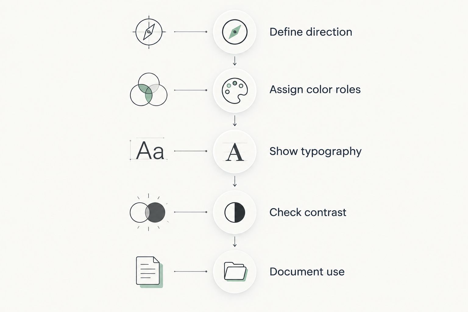
Follow this sequence:
- Define direction: Write the audience and message the visuals need to support.
- Assign color roles: Label text, backgrounds, accents, and interactive elements.
- Show typography: Display heading and body-text treatments in realistic examples.
- Check contrast: Test approved text-background combinations.
- Document use: Show accepted applications and explain important restrictions.
The sequence prevents a common mistake: approving the board before checking how its choices work together. Test the combination, not just the individual swatches.
For 2026 accessibility checks, use the W3C WCAG 2.2 minimum contrast criteria: normal text requires 4.5:1, while qualifying large text requires 3:1. Large text includes text at least 18 points, or bold text at least 14 points. These thresholds apply to text and its background, not to whether neighboring palette swatches look pleasing together.
Passing those contrast checks does not establish full website accessibility. It resolves one specific question: whether your chosen text-background pairing meets the applicable minimum contrast criterion.
How the tools were ranked
These recommendations rank task fit using the criteria above: complete reference, color control, editing effort, collaboration, handoff clarity, and practical application. They are not a performance benchmark or a claim that the tools were tested against identical projects.
Canva takes the default slot because it combines the elements of a straightforward board. Figma serves a more technical website handoff; Milanote serves exploration. Adobe Express connects the board with content creation, while Coolors and Adobe Color handle narrower palette tasks.
Which brand board tool should you choose?
Choose Canva if you are undecided and need a complete visual reference. Choose Figma when a designer needs to connect that reference with website layouts. Use Milanote when creative direction is still open, and Adobe Express when your content workflow already belongs there.
Choose Coolors or Adobe Color for palette work, then document the decisions in a board-building tool. Neither replaces the written roles, typography examples, and image direction that make a brand board useful.
Bridgetbakerbranding is best suited to coaches, speakers, authors, and founders seeking branding and Squarespace website design. If your uncertainty concerns what the brand should communicate rather than how to arrange swatches, address that decision before selecting software.
FAQ
What's the best brand board tool for a beginner?
Canva is the default recommendation for a beginner assembling a complete visual brand reference. It brings colors, typography examples, imagery, and logo assets into one layout; you still need to label their intended uses.
Is Figma better than Canva for a brand board?
Figma is better suited to a brand board that supports collaborative website design, while Canva suits a straightforward everyday reference. Choose based on the handoff you need rather than the size of the feature list.
Can I use Coolors to make a complete brand board?
Coolors supports palette exploration, not a complete brand board. Use a board-building tool to document typography, logo treatments, image direction, and the approved roles of your colors.
What's the difference between a mood board and a brand board?
A mood board explores visual direction, while a brand board records approved visual choices. Keep references under discussion separate from assets and treatments your collaborators should actually use.
How do I know whether my brand colors are readable?
Check the contrast ratio of each intended text-background combination. WCAG 2.2 requires at least 4.5:1 for normal text and 3:1 for qualifying large text under its minimum contrast criterion.
Should I choose Adobe Express or Adobe Color?
Choose Adobe Express to compose a brand reference alongside content designs; choose Adobe Color to explore color relationships and image-derived themes. Adobe Color does not replace a complete board-building workflow.
Do I need branding help before choosing a tool?
Get branding help first if your audience, message, or visual direction is unresolved. Bridgetbakerbranding serves coaches, speakers, authors, and founders with branding, Squarespace website design, and visibility coaching; software organizes decisions rather than making them for you.
One last thing
Test your board without explaining it aloud. Give someone the reference and ask them to identify the heading font, body-text color, background treatment, and approved image direction. If they cannot find those decisions, revise the labels before making the board prettier.
A brand board earns its place when another person can use it correctly. That is the standard to apply before your next website or content handoff.