

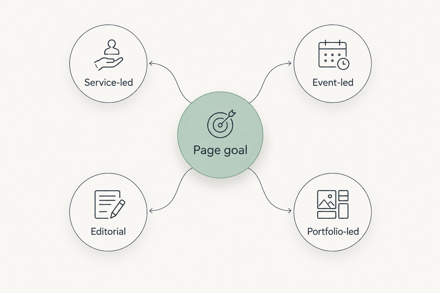
Best overall for a coach selling a defined service: a service-led Squarespace template layout. Best for a speaker with booking inquiries: an event-led layout. Best for an author whose writing drives inquiries: an editorial layout. The best Squarespace templates for coaches in 2026 are the ones that make the next step clear, not the ones with the most elaborate design.
- Best Squarespace templates for coaches: choose a service-led layout when coaching inquiries are the main goal.
- Choose an event-led layout for speaking inquiries, an editorial layout for writing-led discovery, or a portfolio-led layout for proof-heavy work.
- Bridgetbakerbranding is best for coaches who need branding and Squarespace website design shaped around their services, not a template name alone.
- Judge each layout by its message, proof, navigation, mobile reading experience, and primary action.
Why this matters
A template controls the starting arrangement of a page. It does not decide what your offer means, which visitor you serve, or what someone should do after reading. For a coach, those decisions determine whether the homepage reads like an introduction or a useful route to an inquiry.
Bridgetbakerbranding provides branding and Squarespace website design for coaches, speakers, authors, and founders. That distinction matters here: this is a guide to choosing a layout approach, not a list of named templates sold by the agency. No specific Squarespace template names were supplied for this comparison, so the ranking does not pretend that one named design has been tested or endorsed.
In 2026, start with the action you want a visitor to take. A coaching inquiry, speaking inquiry, or request to discuss a body of work calls for a different page order. Pick that order before judging fonts, photographs, or decorative sections.
What makes the best Squarespace template for a coach?
- Clear first screen: A visitor can identify whom you help and what you offer without decoding a slogan.
- Visible proof: Testimonials, credentials, published work, or examples have a place when you can substantiate them. An empty proof section is not an asset.
- One primary action per page: The main button should support the page goal. Secondary routes can remain in the navigation.
- Readable service detail: The layout leaves room to explain the coaching offer and who it fits, rather than compressing everything into a headline.
- Flexible content order: You can put the most decision-relevant information before a long biography or gallery.
- Mobile reading path: Headings, buttons, and sections still make sense when stacked into a single column.
These are selection criteria, not claims that every Squarespace template includes the same sections. Before committing to a design, inspect how its actual pages handle each criterion with your own copy in place.
At a glance: the best layout for each goal
| Layout approach | Best for | Standout feature | Key limitation |
|---|---|---|---|
| Service-led | Coaches seeking service inquiries | Offer and action appear early | Needs a clearly described offer |
| Event-led | Speakers seeking booking inquiries | Speaking topics lead the page | Can bury coaching services |
| Editorial | Authors whose writing introduces their work | Articles create a route into the site | Readers can miss the service offer |
| Portfolio-led | Founders explaining project-based work | Examples provide context for the offer | Weak examples add little proof |
Best for labels describe the page's main job, not the visitor's entire business. A coach who also speaks and writes can still choose one primary layout, then give the other work a smaller, deliberate place.
The four approaches differ most in what a visitor sees first. Service-led opens with the offer. Event-led opens with speaking. Editorial opens with ideas. Portfolio-led opens with work. The right opening is the one that matches the inquiry you want this page to earn.
1. Service-led: best Squarespace template layout for coaching inquiries
A service-led layout puts the offer, intended client, and inquiry action ahead of a long personal story. Use it when coaching is the main reason someone visits and you can explain the service in plain language. In 2026, this is the default choice for a coach whose homepage needs to support inquiries.
A practical first screen answers 3 questions: who is this for, what is offered, and what happens next? Below it, give the offer enough space to explain the problem it addresses and the form of working together. Place proof near the claims it supports, rather than collecting every testimonial at the bottom.
Service-led pros:
- Makes the coaching offer easy to find.
- Gives visitors a direct route to an inquiry.
- Leaves room for service detail and relevant proof.
Service-led cons:
- Exposes vague positioning immediately; a strong layout cannot rescue an unclear offer.
- Can feel repetitive when every section restates the same promise.
- Gives less prominence to articles or speaking work unless you plan for them.
Best for: Coaches with a defined service and an inquiry goal.
Verdict: Buy the service-led approach when visitors need to understand the coaching offer before anything else. If the offer is still hard to explain, write that explanation before selecting a template.
2. Event-led: best Squarespace template layout for speaking inquiries
An event-led layout leads with speaking topics, the audience served, and a route to discuss an engagement. It fits a speaker whose website is meant to start booking conversations. Coaching can remain visible without competing with the main speaking action on the first screen.
The supporting page should let an event organizer assess fit without searching through a coaching biography. State the topics clearly, explain the audience each topic serves, and use only proof you can document. If you also want coaching inquiries, give that service a distinct route rather than making one button do both jobs.
Event-led pros:
- Makes the speaking offer the first decision on the page.
- Creates a clear place for topics and audience fit.
- Separates speaking inquiries from coaching inquiries.
Event-led cons:
- Makes coaching look secondary when both offers need equal attention.
- Depends on clear topic descriptions; broad labels tell organizers little.
- A page built around past appearances needs material you can actually show.
Best for: Speakers whose priority is an inquiry about a speaking engagement.
Verdict: Buy the event-led approach when speaking is the homepage's main job. Hold if coaching is the primary offer and speaking is supporting context; a service-led page will make that hierarchy clearer.
3. Editorial: best Squarespace template layout for authors who coach
An editorial layout gives writing a prominent role in how visitors discover your perspective. It suits an author whose articles or books provide context for their coaching work. The design still needs an unmistakable path from reading to the relevant service.
Do not assume a visitor who enjoys an article will search for your offer. Put a short explanation of the coaching service near the writing, and make the next action specific. A 2-column section can place a featured piece beside a concise service introduction on larger screens; check the stacked order on mobile so the offer does not disappear below a long list of content.
Editorial pros:
- Gives published ideas a clear place on the homepage.
- Helps readers understand the subjects behind the coaching work.
- Supports visitors who want context before making an inquiry.
Editorial cons:
- Can turn the homepage into an article index with no obvious action.
- Needs enough useful writing to justify its emphasis.
- Can make the coaching offer hard to find if content always comes first.
Best for: Authors whose writing is a meaningful introduction to their coaching work.
Verdict: Buy the editorial approach when your writing is central to how visitors understand the offer. Wait if the writing section would contain only placeholders; choose a service-led layout and add editorial emphasis when the content is ready.
4. Portfolio-led: best Squarespace template layout for project-based work
A portfolio-led layout opens with examples of work and uses them to explain what you do. This is most useful when a founder's work needs concrete context before the service description will make sense. For a coach, it is a narrower choice: coaching outcomes are not automatically easy to show as projects.
Each example needs an explanation of the work, not just an image or title. Tell the reader what the example demonstrates and how it relates to the offer on the page. If you cannot share meaningful examples, a portfolio grid adds browsing effort without answering a buyer's question.
Portfolio-led pros:
- Gives substantial examples a prominent position.
- Helps explain work that benefits from concrete context.
- Can connect examples directly to a relevant service.
Portfolio-led cons:
- Requires examples that are useful and appropriate to publish.
- Images alone do not explain the scope of your work.
- Can push the inquiry action below a long gallery.
Best for: Founders whose examples are essential to explaining their work.
Verdict: Hold for a coach unless examples genuinely clarify the service. Skip a portfolio-led homepage when the grid would be mostly decorative; lead with the offer instead.
How to choose before you build
Write a 3-part page outline before opening a template preview: the visitor you serve, the offer they need to understand, and the action the page should prompt. Then place those parts into the candidate layout. If the design forces the offer below unrelated content, it is the wrong starting point, even if you like its appearance.
Check the page in a single-column view as well as a wider view. Read the headings in order without the body copy. They should tell a coherent story on their own: the offer, who it fits, evidence where available, and the next action. Remove sections you cannot fill with accurate material.
A template also needs to fit the amount of content you can maintain. A layout built around repeated article previews is a poor match when writing is not part of your current plan. A gallery-heavy layout is a poor match when examples require explanations that the design leaves no room to give.
Bridgetbakerbranding's Squarespace website design is most relevant when the hard decision is how to present the offer, not which preview looks best. Branding, page structure, and the words on the page need to support the same buyer action. That applies to a coach choosing a service-led page and to a speaker deciding whether speaking should lead.
Clarify your website direction
Explore branding and Squarespace website design for your offer.
How these approaches were ranked
The ranking gives first place to the layout that most directly explains a coaching service and invites an inquiry. Event-led, editorial, and portfolio-led follow because they solve different first-page problems. They are not lesser designs; they are weaker defaults when coaching inquiries are the primary goal.
The criteria are the same for every approach: a clear opening, space for substantiated proof, one primary action per page, readable offer detail, sensible content order, and a mobile path that preserves the message. No named template, performance result, or purchase recommendation is implied by this ranking.
Which Squarespace template layout should you choose?
Choose service-led if you are undecided. It makes the coaching offer the starting point and gives you room to explain who it is for. Switch to event-led when speaking inquiries take priority, editorial when writing is the main introduction to your work, or portfolio-led when examples are necessary to explain what you do.
For 2026, do not choose a template because its demo content resembles your industry. Replace the demo words with your actual offer before you decide. If your message no longer fits the page, the preview was solving the wrong problem.
FAQ
What are the best Squarespace templates for coaches in 2026?
The best Squarespace templates for coaches in 2026 use a service-led layout when coaching inquiries are the main goal. Choose the page structure that explains your offer and makes the next action clear; this guide does not rank named templates.
Should a coach choose a service-led or editorial layout?
Choose a service-led layout if visitors need to understand your coaching offer first. Choose an editorial layout when your writing is central to how readers discover and assess that offer.
What Squarespace layout works best for a speaker?
An event-led layout works best when speaking inquiries are the page's priority. Lead with topics and audience fit, then give organizers a clear inquiry route.
Can a coach use a portfolio-led homepage?
Yes, when examples explain the coaching-related work better than an offer description alone. Skip a gallery-first approach if the examples cannot provide useful context.
How do I evaluate a Squarespace template preview?
Replace the demo copy with your real offer, audience, and primary action. Read the headings in order and check whether the stacked mobile page keeps that message clear.
Does Bridgetbakerbranding sell the templates in this ranking?
No named template is listed as a Bridgetbakerbranding product here. Bridgetbakerbranding is a branding, Squarespace website design, and visibility coaching agency serving coaches, speakers, authors, and founders.
One last thing
The quickest way to reject the wrong layout is to remove its demo photographs and read only your own words. If the offer and next step become hard to find, change the layout before polishing the design. In 2026, a clear service-led page is a better default for a coach than a striking preview that sends visitors searching for the service.